Telling a data story
Lecture 24
Keep it simple


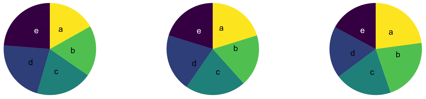
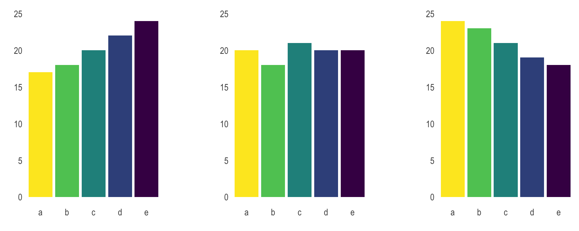
Judging relative area
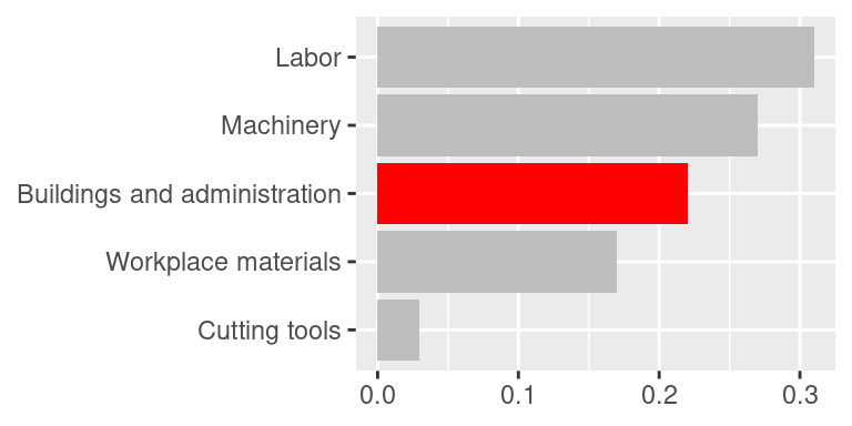
Use color to draw attention

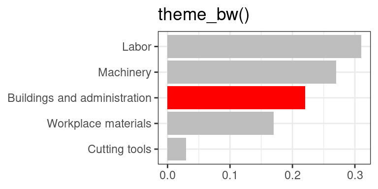
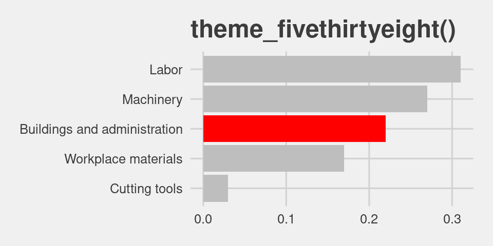
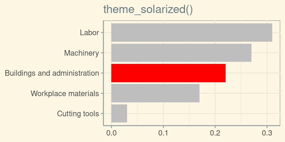
Play with themes for a non-standard look
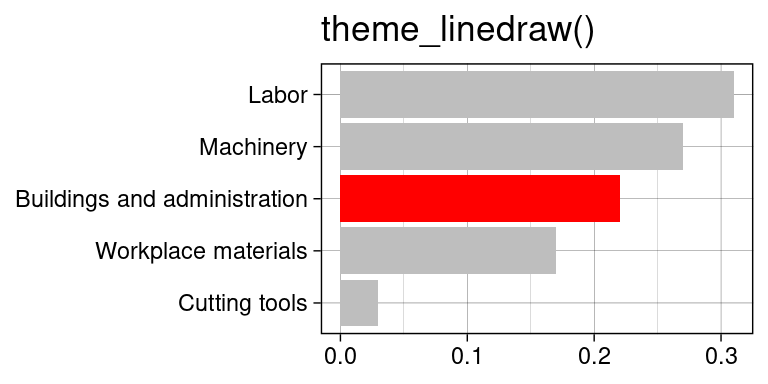
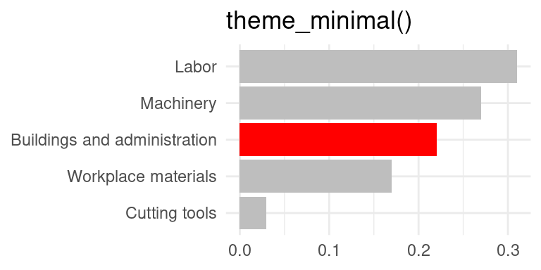
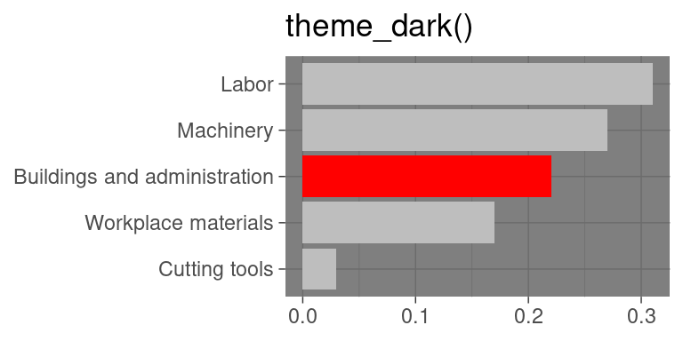
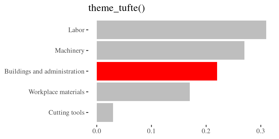
Go beyond ggplot2 themes – ggthemes

Tell a story

Leave out non-story details

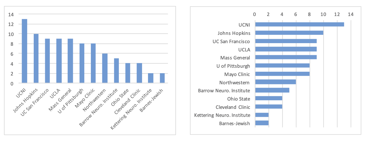
Order matters


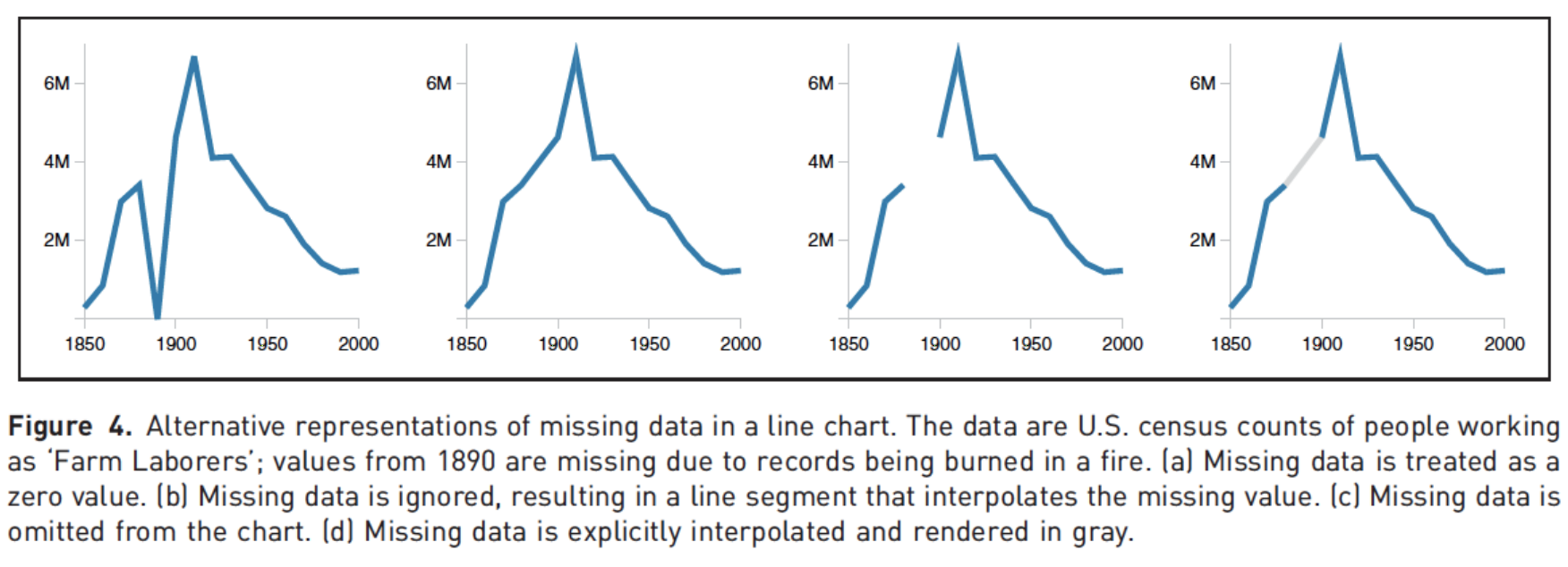
Clearly indicate missing data
Reduce cognitive load
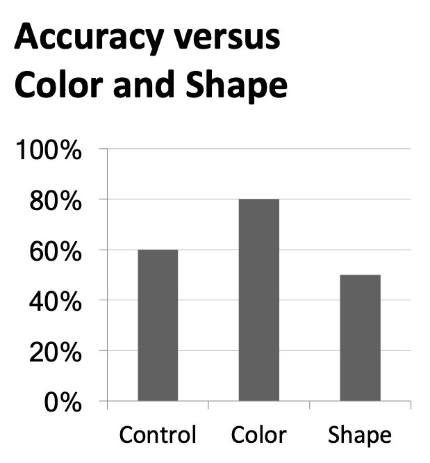
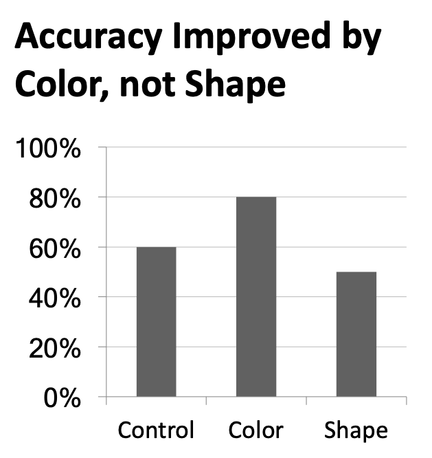
Use descriptive titles
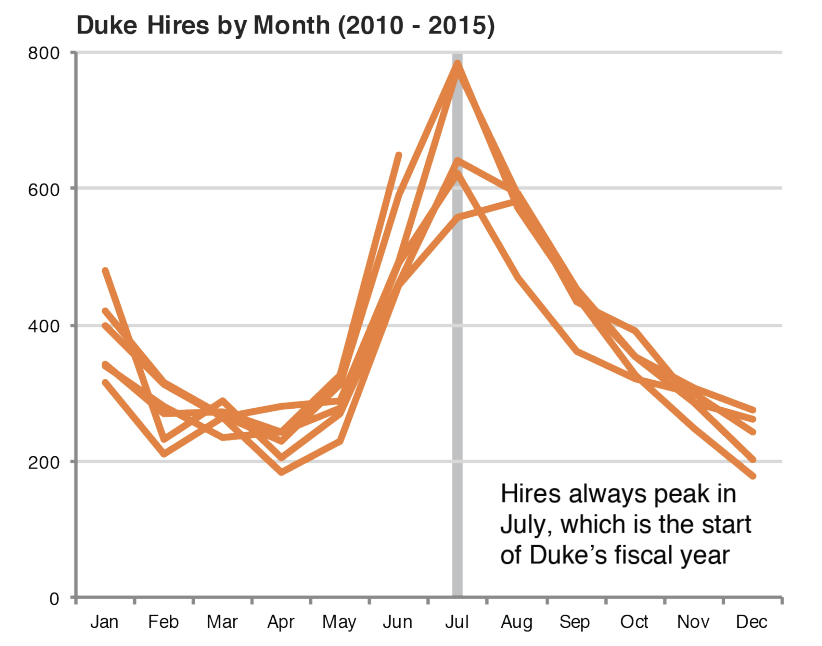
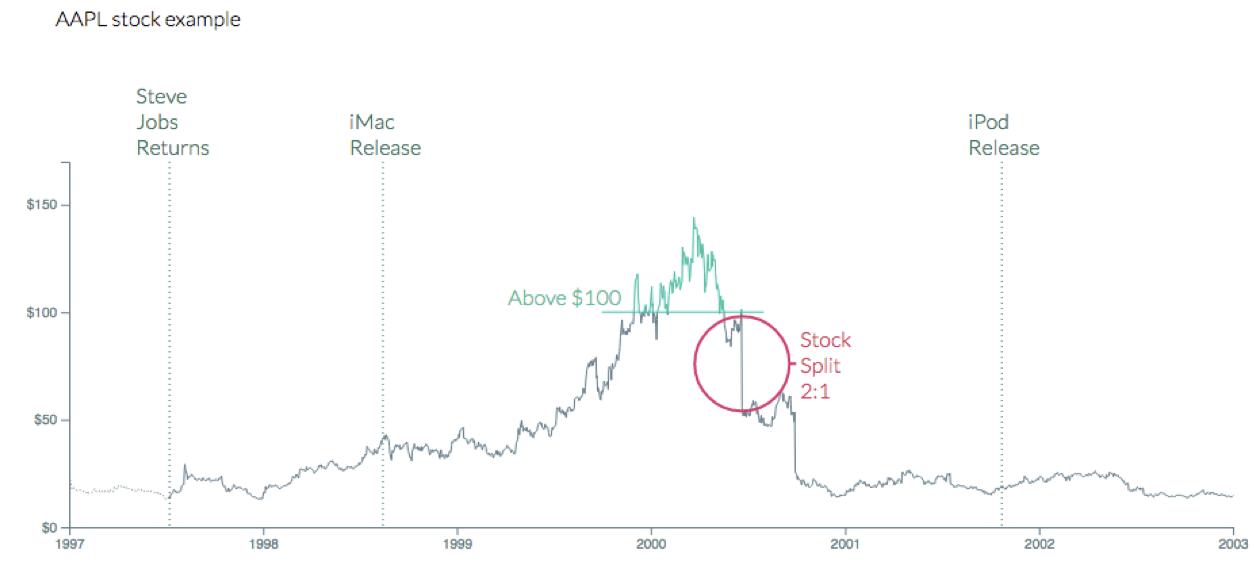
Annotate figures
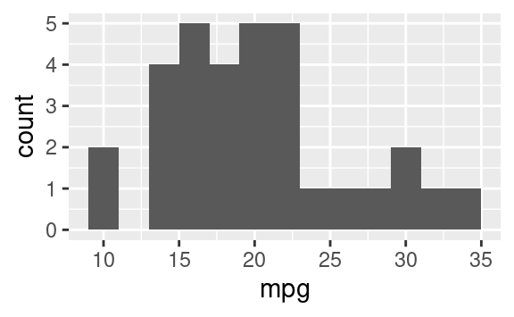
Small fig-width
For a zoomed-in look
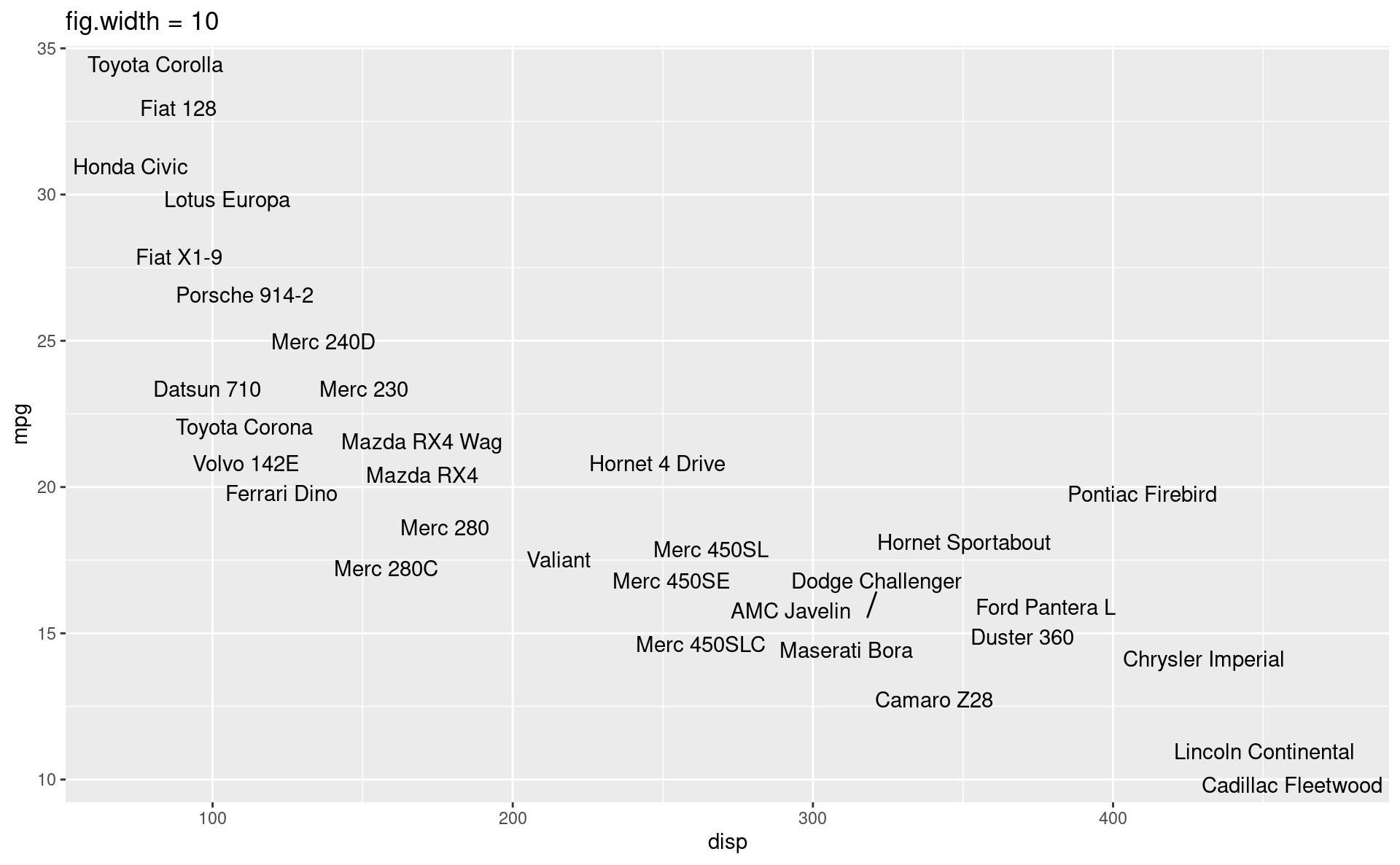
Large fig-width
For a zoomed-out look
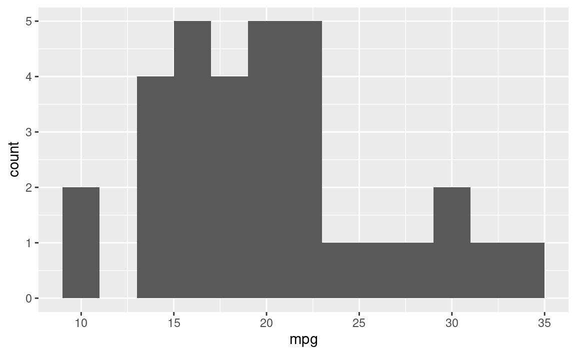
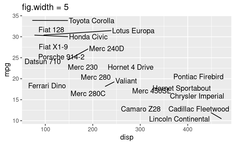
fig-width affects text size
Cross referencing figures
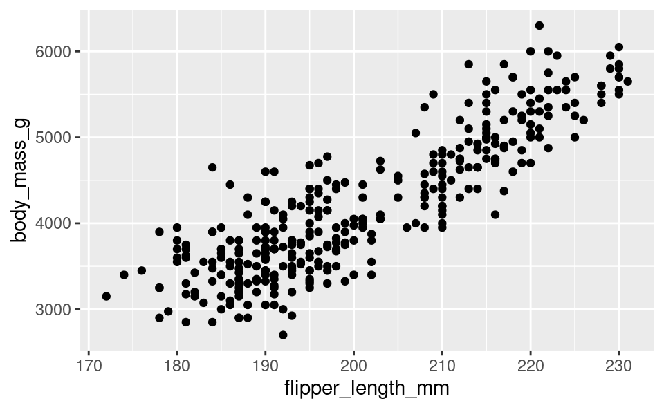
As seen in Figure 1, there is a positive and relatively strong relationship between body mass and flipper length of penguins.
Cross referencing tables
The regression output is shown in Table 1.
penguins_fit <- linear_reg() |>
  fit(body_mass_g ~ flipper_length_mm, data = penguins)

tidy(penguins_fit) |>
knitr::kable(digits = 3)| term | estimate | std.error | statistic | p.value |
|---|---|---|---|---|
| (Intercept) | -5780.831 | 305.815 | -18.903 | 0 |
| flipper_length_mm | 49.686 | 1.518 | 32.722 | 0 |
The regression output is shown in @tbl-penguins-lm.

```{r}
#| label: tbl-penguins-lm
#| tbl-cap: The regression output for predicting body mass from flipper length of penguins.

penguins_fit <- linear_reg() |>
  fit(body_mass_g ~ flipper_length_mm, data = penguins)

tidy(penguins_fit) |>
  knitr::kable(digits = 3)
```![]()