library(tidyverse)
library(tidymodels)Apple and Microsoft stock prices
Application exercise
Today we’ll explore the question “How do stock prices of Apple and Microsoft relate to each other?”
Goals
Understand the grammar of linear modeling, including \(y\), \(x\), \(b\), \(e\) fitted estimates and residuals
Add linear regression plots to your 2D graphs
Write a simple linear regression model mathematically
Fit the model to data in R in a
tidyway
Packages
Data
The data for this application exercise was originally gathered using the tidyquant R package. It features Apple and Microsoft stock prices from January 1st 2020 to December 31st 2021.
First, let’s load the data:
stocks <- read_csv("data/stocks.csv")To keep things simple, we’ll work with a subset of the data, stock prices in January 2020.
stocks_jan2020 <- stocks |>
  filter(month(date) == 1 & year(date) == 2020)
Models and residuals
Exercise 1
At first, you might be tempted to minimize \(\sum_i e_i\), the sum of all residuals, but this is problematic. Why? Can you come up with a better solution (other than the one listed below)?
Add response here.
Minimize the sum of squared residuals
In practice, we minimize the sum of squared residuals:
\[ \sum_i e_i^2 \]
Note, this is the same as
\[ \sum_i (y_i - \hat{y}_i)^2 \]
Exercise 2
Check out an interactive visualization of “least squares regression” here. Click on I and drag the points around to get started. Describe what you see.
Add response here
Plotting the least squares regression line
Plotting the OLS regression line, that is, the line that minimizes the sum of square residuals takes one new geom. Simply add
geom_smooth(method = "lm", se = FALSE)to your plot.
method = "lm" says to draw a line according to a “linear model” and se = FALSE turns off standard error bars. You can try without these options for comparison.
Optionally, you can change the color of the line, e.g.
geom_smooth(method = '"lm", se = FALSE, color = "red")Exercise 4
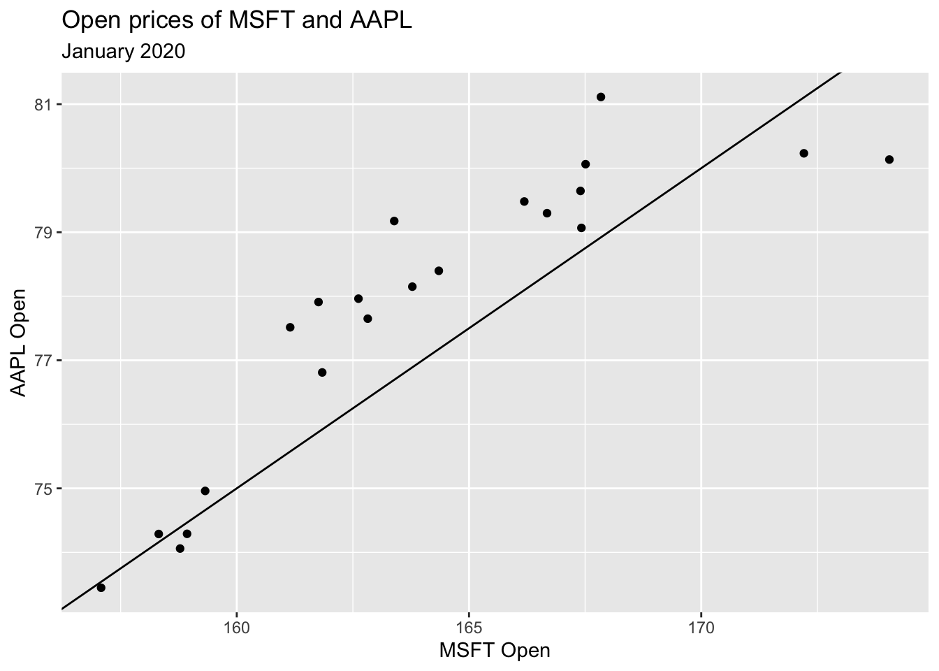
In the slides we fit a model with slope 0.5 and intercept -5. The code for layering the line that represents the model over your data is given below. Add geom_smooth() as described above with color = "steelblue" to see how close your line is.
ggplot(stocks_jan2020, aes(x = MSFT.Open, y = AAPL.Open)) +
  geom_point() +
  geom_abline(slope = 0.5, intercept = -5) +
  # add code here
  labs(
    x = "MSFT Open",
    y = "AAPL Open",
    title = "Open prices of MSFT and AAPL",
    subtitle = "January 2020"
  )
Finding \(\hat{\beta}\)
To fit the model in R, i.e. to “find \(\hat{\beta}\)”, use the code below as a template:
model_fit <- linear_reg() |>
fit(y ~ x, data = dataframe)linear_regtellsRwe will perform linear regressionfitdefines the outcome \(y\), predictor \(x\) and the data set
Running the code above, but replacing the arguments of the fit command appropriately will create a new object called model_fit that stores all information about your fitted model.
To access the information, you can run, e.g.
tidy(model_fit)Let’s try it out.
Exercise 5
Find the least squares line \(y = \hat{\beta_0} + \hat{\beta_1} x\) for January 2020, where \(x\) is Microsoft’s opening price and \(y\) is Apple’s opening price. Display a tidy summary of your model.
# code hereExercise 6
Re-write the fitted equation replacing \(\hat{\beta}_0\) and \(\hat{\beta}_1\) with the estimates from the model you fit in the previous exercise.
\[ \text{[add equation here]} \]
Exercise 7
Interpret \(\hat{\beta}_0\) and \(\hat{\beta}_1\) in context of the data.
Add response here
Bonus exercise
Say Microsoft opens at 166 dollars. What do I predict the opening price of AAPL to be?
# add code here