library(tidyverse)
library(tidymodels)
library(openintro)Climate change
Application exercise
In this application exercise, we’ll do inference for a comparing two paired means and many means.
Packages
We’ll use the tidyverse, tidymodels, openintro, and ggthemes packages.
Paired means
Throughout this application exercise, we’ll make use of the climate70 dataset supplied by the openintro package.
glimpse(climate70)Rows: 197
Columns: 7
$ station <fct> USC00203823, USC00276818, USC00186620, USC00331890, USC00235…
$ latitude <dbl> 41.93520, 44.25800, 39.41317, 40.24030, 37.83950, 45.56550, …
$ longitude <dbl> -84.64110, -71.25250, -79.40025, -81.87100, -94.37400, -100.…
$ dx70_1948 <int> 131, 80, 143, 156, 216, 138, 131, 194, 198, 213, 224, 74, 17…
$ dx70_2018 <int> 147, 99, 150, 158, 175, 132, 129, 188, 240, 213, 191, 101, 2…
$ dx90_1948 <int> 11, 1, 4, 18, 59, 39, 23, 17, 46, 67, 49, 0, 34, 35, 71, 100…
$ dx90_2018 <int> 16, 1, 1, 15, 51, 18, 17, 3, 65, 104, 39, 0, 62, 3, 86, 117,…The question we want to answer is: Do these data provide convincing evidence that the number of days above 90 degrees between 2018 and 1948?
First, let’s set the hypotheses.
Add response here.
To carry out inference on paired data, we pre-compute the difference between paired values at the beginning of the analysis, and use those differences as our values of interest.
climate70 <- climate70 |>
  mutate(dx90_diff = dx90_2018 - dx90_1948)

climate70 |>
   select(station, latitude, longitude, contains("dx90"))
# A tibble: 197 × 6
station latitude longitude dx90_1948 dx90_2018 dx90_diff
<fct> <dbl> <dbl> <int> <int> <int>
1 USC00203823 41.9 -84.6 11 16 5
2 USC00276818 44.3 -71.3 1 1 0
3 USC00186620 39.4 -79.4 4 1 -3
4 USC00331890 40.2 -81.9 18 15 -3
5 USC00235987 37.8 -94.4 59 51 -8
6 USC00395691 45.6 -100. 39 18 -21
7 USC00219046 43.8 -94.2 23 17 -6
8 USW00003812 35.4 -82.5 17 3 -14
9 USC00047643 38.5 -122. 46 65 19
10 USW00013896 34.7 -87.6 67 104 37
# ℹ 187 more rowsAnd then visualize these differences:
ggplot(climate70, aes(x = dx90_diff)) +
  geom_histogram()
`stat_bin()` using `bins = 30`. Pick better value with `binwidth`.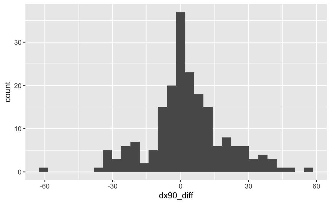
We calculate the observed statistic in the paired setting in the same way that we would outside of the paired setting. Using specify() and calculate():
obs_stat <- climate70 |>
  specify(response = dx90_diff) |>
  calculate(stat = "mean")

obs_stat
Response: dx90_diff (numeric)
# A tibble: 1 × 1
stat
<dbl>
1 2.90Now, we want to compare this statistic to a null distribution, generated under the assumption that the true difference was actually zero, to get a sense of how likely it would be for us to see this observed difference or something more extreme.
Tests for paired data are carried out via the null = "paired independence" argument to hypothesize().
set.seed(1129)

null_dist <- climate70 |>
   specify(response = dx90_diff) |>
   hypothesize(null = "paired independence") |>
   generate(reps = 1000, type = "permute") |>
   calculate(stat = "mean")

visualize(null_dist)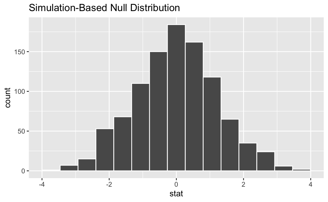
For each replicate, generate() carries out type = "permute" with null = "paired independence" by:
- Randomly sampling a vector of signs (i.e., -1 or 1), probability 0.5 for either, with length equal to the input data, and
- Multiplying the response variable by the vector of signs, “flipping” the observed values for a random subset of value in each replicate
To get a sense for what this distribution looks like, and where our observed statistic falls, we can use visualize():
visualize(null_dist) +
  shade_p_value(obs_stat, direction = "two-sided")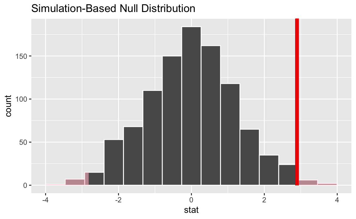
Then, we calculate the p-value:
p_value <- null_dist |>
  get_p_value(obs_stat, direction = "two-sided")

p_value
# A tibble: 1 × 1
p_value
<dbl>
1 0.016